You’ve perfected your tealight candles. The wax blend burns clean for hours. Your scents are subtle but memorable. Your pricing is competitive. Orders are coming in steadily… but not as many as you’d hoped.
Then one day, you’re browsing a competitor’s website, and it hits you: their tealights look premium, professional, and worth every penny. Yours? They look like they belong at a dollar store clearance sale.
The difference isn’t the product. It’s the packaging.
Here’s a hard truth that most tealight candle makers learn too late: custom tealight candle boxes aren’t just about protecting your product—they’re silent salespeople working 24/7 to convince customers your candles are worth buying. And right now, yours might be doing the opposite.
The good news? Most tealight packaging mistakes are surprisingly easy to fix once you know what to look for. Let’s dive into the eight most common design mistakes that are quietly killing your sales—and exactly how to fix them.
🎨 Mistake #1: Treating Tealights Like They’re Too Small to Matter
Walk into any boutique candle shop, and you’ll notice something interesting: the tealights often have the most thoughtful, detailed packaging of any product in the store. There’s a reason for that.
Why “Just a Tealight” Thinking Destroys Your Brand
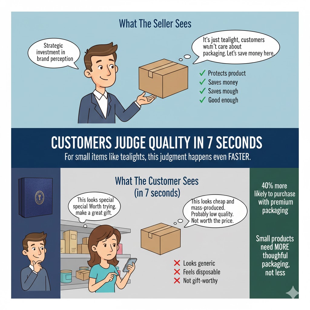
Many candle makers fall into the trap of thinking, “They’re just tealights—customers won’t care about fancy packaging.” This couldn’t be more wrong.
Tealights are often impulse purchases or additions to larger orders. They’re the products customers grab at checkout, gift as small thank-yous, or buy in multiples to try different scents. That means your packaging needs to work harder, not less, to justify the purchase.
When your tealight packaging looks like an afterthought, customers assume your product is an afterthought too. They’ll choose the competitor whose packaging suggests their tealights are special—even if your actual candles are superior.
The Premium Presentation Paradox
Here’s something fascinating: according to Packaging of the World, consumers judge product quality within the first seven seconds of seeing packaging. For small items like tealights, this judgment happens even faster because there’s less product to evaluate.
Your tealight packaging is doing one of two things:
- Convincing customers they’re getting a premium product worth the price
- Making them wonder why they’d pay more than bargain-bin prices
There’s no middle ground. The small size of tealights means every design choice gets magnified, not diminished.
Elevating Small Products With Strategic Design
The solution isn’t complicated—it’s intentional. Your tealight packaging should include:
- Clean, professional graphics that match your brand aesthetic
- High-quality materials that feel substantial despite the small size
- Thoughtful color choices that convey your brand personality
- Clear product information without cluttering the limited space
- Design elements that photograph well for social media
Ray Packaging specializes in helping tealight makers create packaging that treats every product—no matter how small—as worthy of premium presentation.
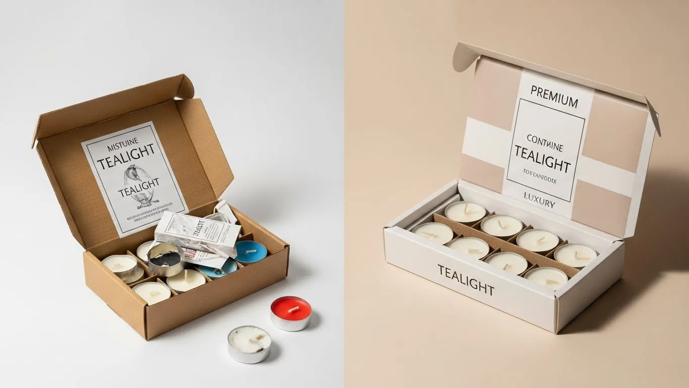
📦 Mistake #2: Using Generic Boxes That Hide Your Product’s Best Features
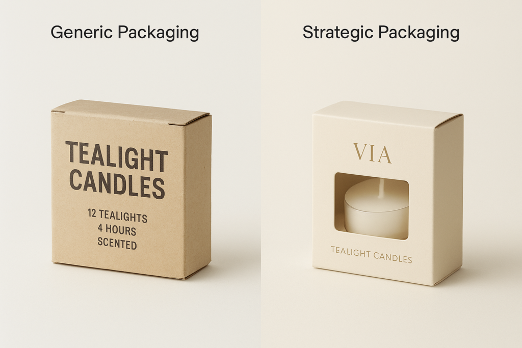
You know what makes your tealights special. Maybe it’s your unique wax blend, your hand-poured quality, or your carefully curated scent combinations. But if your packaging doesn’t showcase these selling points, customers will never know.
The Visibility Problem Most Sellers Ignore
Generic cardboard boxes that completely hide your tealights create a trust barrier. Customers can’t see what they’re buying, which makes them hesitant to purchase—especially if they’re trying your brand for the first time.
This is particularly problematic for tealights because much of their appeal is visual: the color of the wax, the quality of the container, the overall aesthetic. When you hide all of this behind opaque packaging, you’re essentially asking customers to buy blind.
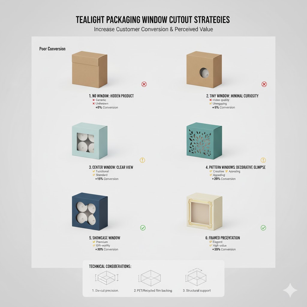
Window Cutouts That Actually Sell
The fix is simple but powerful: incorporate strategic window cutouts into your tealight packaging. These aren’t just decorative—they’re conversion tools.
Effective window designs should:
- Display the actual product so customers can see what they’re buying
- Highlight colors or unique features that differentiate your tealights
- Create visual interest that draws eyes on crowded shelves or in photos
- Show quality by letting the product speak for itself
- Build trust through transparency (literally and figuratively)
Balancing Protection With Presentation
Some sellers worry that windows weaken packaging or expose products to damage. This is a valid concern, but modern custom packaging solves this with reinforced window designs that maintain structural integrity while showcasing your product.
Ray Packaging’s design team can help you find the perfect balance between visibility and protection, ensuring your tealights arrive safely while looking their absolute best.
🏷️ Mistake #3: Cramming Too Much Information Into Too Little Space
Your tealight packaging has limited real estate. When you try to fit your entire brand story, ingredient list, burning instructions, and social media handles onto a 3×3 inch box, the result is visual chaos that repels rather than attracts customers.
The Readability Crisis on Small Packaging
Here’s what happens when tealight packaging gets overcrowded:
- Text becomes too small to read without squinting
- Important information gets lost in the clutter
- The overall design looks unprofessional and cheap
- Customers feel overwhelmed and move on to clearer options
- Your brand message gets completely diluted
The irony is that in trying to communicate everything, you end up communicating nothing effectively.
The Hierarchy of Information That Actually Converts
Not all information is equally important on tealight packaging. Here’s what should take priority:
Essential (must include):
- Brand name and logo
- Scent name or description
- Burn time or quantity
- Basic safety information
Secondary (include if space allows):
- Website or social media handle
- Brief brand tagline
- Material information (soy, beeswax, etc.)
Unnecessary (save for website or inserts):
- Detailed ingredient lists
- Your complete brand story
- Multiple social media platforms
- Extensive burning instructions
Creating Clean, Scannable Designs
The solution is embracing white space and minimalism. Your tealight packaging should communicate the essentials clearly and direct customers to your website for additional information.
Use QR codes strategically—they take up minimal space but can link to detailed product information, burning instructions, or your online store. This keeps your physical packaging clean while still providing access to comprehensive details.
🎭 Mistake #4: Inconsistent Branding Across Your Tealight Line
You have five different tealight scents, and somehow they all look like they’re from different brands. One has floral graphics, another uses geometric patterns, a third features hand-drawn illustrations. The result? Customers don’t recognize your products as a cohesive line.
Why Visual Consistency Builds Brand Recognition
Brand recognition doesn’t happen by accident—it happens through consistent visual repetition. When customers see your distinctive packaging style across multiple products, they start to remember and trust your brand.
Inconsistent tealight packaging creates confusion:
- Customers don’t realize all the scents are from your brand
- Your display or online store looks disorganized
- You miss opportunities for customers to collect multiple scents
- Building brand loyalty becomes nearly impossible
- Each product competes with your other products instead of supporting them
Creating a Cohesive Product Family
The fix requires establishing clear brand guidelines for your tealight packaging. This doesn’t mean every box looks identical—it means they share unifying elements:
- Consistent color palette with variations for different scents
- Same typography across all products
- Unified layout structure that customers recognize
- Shared design elements like patterns, borders, or graphic styles
- Logo placement in the same position on every box
Balancing Unity With Variety
You can (and should) differentiate between scents while maintaining brand consistency. Use a standard template with variable elements:
- Keep your logo, brand colors, and layout consistent
- Change accent colors to represent different scent categories
- Vary illustrations or patterns while maintaining the same artistic style
- Use consistent fonts but adjust text content for each scent
Ray Packaging’s design support helps you create a cohesive product line that looks professional and intentional, making it easy for customers to recognize and trust your brand.
💰 Mistake #5: Choosing Materials That Feel Cheap (Even If They’re Not)
Your tealights might be premium quality, but if your packaging feels flimsy or looks cheap, customers will assume your product is low-quality too. Material choice matters more than most sellers realize.
The Touch Test That Makes or Breaks Sales
Customers make quality judgments through multiple senses, and touch is surprisingly influential. When someone picks up your tealight packaging and it feels thin, bendable, or cheap, their brain immediately categorizes your product as low-value.
This happens subconsciously—they might not even realize they’re making this judgment. But it affects their purchasing decision nonetheless.
Material Choices That Communicate Quality
Different materials send different messages to customers:
Kraft cardboard:
- Conveys natural, eco-friendly values
- Works well for rustic or organic brands
- Feels substantial without being heavy
- Affordable but doesn’t feel cheap
Glossy coated stock:
- Signals premium, luxury products
- Photographs beautifully for marketing
- Protects against moisture and wear
- Justifies higher price points
Matte finishes:
- Suggests sophistication and modern style
- Feels smooth and upscale
- Reduces glare in photos
- Appeals to contemporary aesthetic
Textured papers:
- Creates memorable tactile experiences
- Differentiates from competitors
- Adds perceived value
- Makes packaging feel more expensive
The Weight Factor You Can’t Ignore
Beyond material type, cardstock weight matters enormously. Thin, lightweight boxes feel disposable. Heavier stock feels valuable and worth keeping.
For tealights, Ray Packaging typically recommends materials between 18pt and 24pt thickness. This provides enough substance to feel premium without adding unnecessary bulk or cost.
🌍 Mistake #6: Ignoring Sustainability (When Your Customers Care Deeply)
Tealight candle buyers tend to be environmentally conscious consumers. They care about natural waxes, clean burning, and sustainability. So when your packaging screams “landfill material,” you’re actively turning away your target audience.
The Eco-Conscious Candle Customer Disconnect
Think about it: your customer chose tealights made with soy or beeswax specifically to avoid petroleum-based products. They read your website copy about sustainable practices. Then they receive a package with non-recyclable plastics, excessive padding, or materials that can’t be composted.
The cognitive dissonance is jarring. Your packaging contradicts everything your brand claims to stand for.
Sustainable Options That Don’t Compromise Quality
Many tealight makers assume eco-friendly packaging means compromising on appearance or protection. This simply isn’t true with modern sustainable materials:
- Recycled cardboard that’s just as strong as virgin materials
- Biodegradable inks that don’t contaminate recycling streams
- Compostable coatings instead of plastic lamination
- FSC-certified papers from responsibly managed forests
- Minimal packaging designs that reduce waste without sacrificing protection
Communicating Your Environmental Values
Don’t just use sustainable materials—tell customers about it. Include small indicators on your packaging:
- Recycling symbols with clear instructions
- “Made from recycled materials” badges
- “Fully recyclable” messaging
- QR codes linking to your sustainability practices
- Encouragement to reuse or repurpose boxes
This transparency resonates with environmentally conscious buyers and gives them another reason to choose your brand over competitors who haven’t prioritized sustainability.
📸 Mistake #7: Packaging That Photographs Terribly (Death for Online Sales)
In today’s market, most customers see your tealights online before (or instead of) seeing them in person. If your packaging doesn’t photograph well, you’re losing sales before customers even consider your product.
The Instagram Test Your Packaging Is Failing
Pull up your product photos right now. Be honest: would you stop scrolling for them? Do they look professional, eye-catching, and worth sharing?
Poor packaging photography kills online sales because:
- Customers can’t accurately judge quality from bad photos
- Unprofessional images erode trust in your brand
- Your products get lost in feeds of better-photographed competitors
- Customers assume the actual product is as lackluster as the photos
- You can’t leverage user-generated content if nobody wants to photograph your packaging
Design Elements That Excel in Photos
Some design choices photograph beautifully, while others fall flat. For tealight packaging that looks amazing in photos:
Colors that pop:
- High contrast combinations that stand out in feeds
- Jewel tones that photograph richly
- Avoiding muddy midtones that look dull on screen
- Considering how colors appear under different lighting
Texture and dimension:
- Embossing or debossing that creates visual interest
- Matte finishes that reduce glare and hot spots
- Foil accents that catch light beautifully
- Strategic shadows created by dimensional elements
Clean, uncluttered designs:
- Simple compositions that read clearly in small images
- Avoiding tiny text that disappears in thumbnails
- Bold graphics that remain recognizable when scaled down
- Negative space that helps elements stand out
Optimizing for Both Professional and Customer Photos
Your packaging needs to work in two contexts: your professional product photography and your customers’ casual smartphone photos.
Professional shots benefit from sophisticated design elements and subtle details. Customer photos need bold, instantly recognizable branding that looks good even in less-than-perfect lighting or composition.
Ray Packaging’s design team understands this dual requirement and creates tealight packaging that excels in both scenarios, helping you generate professional marketing content and encourage organic social sharing.
🛒 Mistake #8: Single-Purpose Packaging That Wastes Opportunities
Your tealight packaging serves one purpose: getting candles safely from your warehouse to your customer’s hands. Then it goes in the trash, along with every marketing opportunity you could have captured.
The Hidden Marketing Real Estate You’re Throwing Away
Every tealight box that leaves your facility is potential marketing space you’ve already paid for. The question is: are you using it effectively, or are you literally throwing money away?
Most sellers miss opportunities to:
- Encourage repeat purchases with discount codes
- Build social media following with clear handles and CTAs
- Collect email subscribers through QR codes
- Cross-sell other products with interior printing
- Generate reviews with simple review requests
- Create brand ambassadors through shareable moments
Turning Boxes Into Multi-Purpose Marketing Tools
Strategic interior printing transforms disposable packaging into valuable marketing space:
Inside the lid:
- “Thank you for supporting small business!” messages
- QR codes linking to exclusive discounts
- Social media handles with encouragement to share
- Brief burning tips that demonstrate expertise
Inside the box:
- Showcase other products with small images
- Include a discount code for next purchase
- Add your brand story in compelling, brief text
- Feature your website prominently
On the bottom:
- Recycling instructions showing environmental responsibility
- Manufacturing details building trust and transparency
- Batch numbers for quality control and authenticity
Creating Reusable Packaging Worth Keeping
Better yet, design tealight packaging so beautiful or functional that customers don’t want to throw it away:
- Boxes that double as drawer organizers
- Designs worth displaying on shelves
- Packaging that can be repurposed for gifts
- Collectible designs that encourage keeping full sets
When customers keep your packaging, your brand stays in their home, creating ongoing exposure and making reorders more likely.
Ray Packaging helps tealight makers maximize every square inch of packaging real estate, turning single-use boxes into ongoing marketing assets that continue working long after delivery.
Frequently Asked Questions
What’s the ideal size for tealight candle packaging?
The standard tealight packaging size depends on your configuration. For a single tealight, boxes typically measure 1.5″ x 1.5″ x 0.75″. For multi-packs, 4-packs often use 3″ x 3″ x 1″ boxes, while 12-packs might use 4″ x 4″ x 1.5″ dimensions. Ray Packaging can create custom dimensions that fit your specific tealight sizes and quantities perfectly, ensuring secure shipping without wasted space.
Should I use clear packaging or printed boxes for my tealights?
Printed custom boxes with window cutouts offer the best of both worlds—they showcase your product while providing branded surface area for marketing and information. Clear packaging shows the product but offers no branding opportunities, while fully printed boxes without windows can create trust barriers. Strategic window placement on branded boxes typically converts better than either alternative alone.
How can I make my tealight packaging stand out without spending a fortune?
Focus on one or two distinctive design elements rather than expensive finishes everywhere. Consider spot UV on your logo, a unique color combination that’s recognizable as yours, or thoughtful interior printing that surprises customers. Ray Packaging offers affordable customization options with no minimum orders, making premium packaging accessible even for small-batch tealight makers.
What information legally needs to be on tealight packaging?
Requirements vary by location, but generally include your business name and address, product weight or quantity, basic safety warnings about open flames, and any relevant certifications. Keep legally required text legible but not dominant, and direct customers to your website for detailed ingredients or extended information to keep packaging clean and uncluttered.